��ʶ����--�����ۺ��嵼���ʶ���
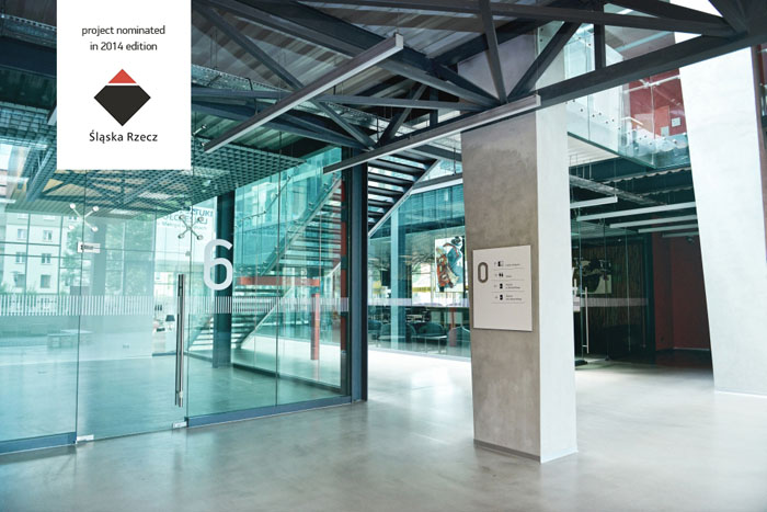
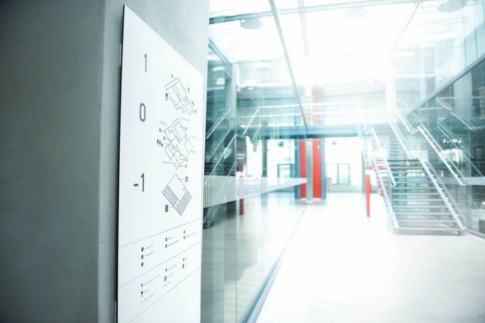
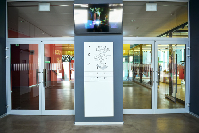
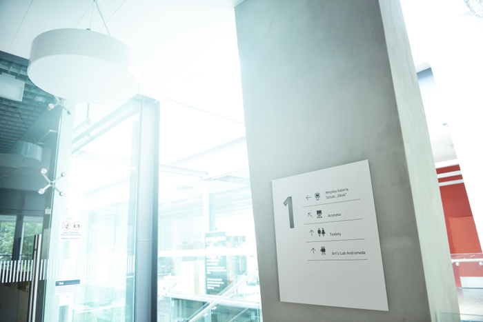
Wyafinding system for Andromeda - culural and commercial passage in Tychy, Poland. The building, former city cinema, was carefully renovated and redesigned in 2013-14.
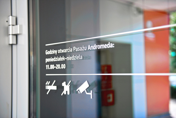
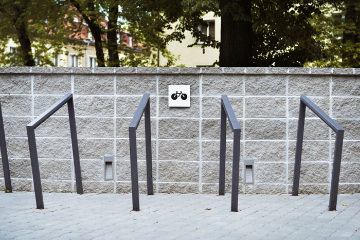
The architects planned the space to be painted with bold and bright colours, so our role was to fit in the scheme. That's why we decided to design a set of massive (not fully linear) pictograms. The weight they have make them look a little bit funny and friendly.
Project was nominated for ?l?ska Rzecz 2014 Award (for best graphic design in Silesia).
